Charity Website Redesign: How NDFA Went From Boxes to Donate
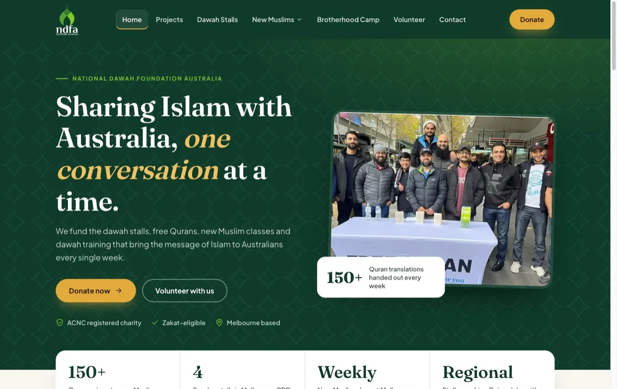
Today we put a new website live for National Dawah Foundation Australia.
NDFA is a registered charity in Melbourne. Every week they fund dawah stalls, give away more than 150 English translations of the Quran, run a class for new Muslims and train people to do dawah themselves. That is a lot of real work, done every single week.
Their old website didn't show any of it.
What the old site looked like
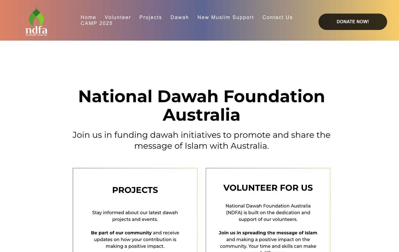
It wasn't broken. It had the right information. But here is what a visitor actually saw:
A white page of bordered boxes, each with a block of small centred text and a different coloured button.
Justified paragraphs that left gaps between words and were hard to read.
A header where the menu wrapped onto two lines, with a "CAMP 2025" link still sitting there in 2026.
On a phone, a lot of empty space before you got to anything useful.
None of that is unusual. I see versions of it every week when I look at small business and charity sites. The site gets built once, the organisation gets busy doing the actual work, and the website quietly falls behind.
The cost is invisible. Nobody emails you to say "I was going to donate but your site looked out of date." They just close the tab.
One job per page
Before touching colours or fonts, we asked one question of every page: what do we want this visitor to do?
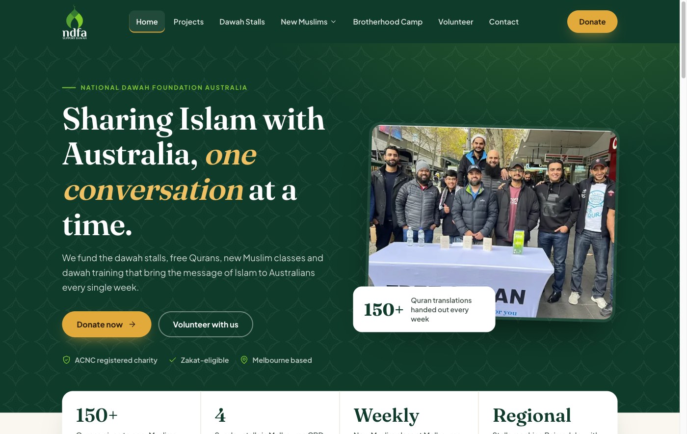
For the homepage the answer was simple. Donate. So the new homepage has one clear call to action in the hero, and everything below it builds the case for that one click.
Volunteering and the new Muslim class still have their own buttons and their own pages. But there is no longer a grid of four equal boxes asking the visitor to choose. When everything is a priority, nothing is.
Put the impact up front
NDFA's best argument is what they do every week. So that went straight under the hero as a row of numbers: 150+ Qurans given every week, the weekly stalls, the weekly new Muslim class.
A donor wants to know their money turns into something real. Numbers do that in two seconds. A paragraph about "promoting peace, compassion and unity" takes thirty seconds and still doesn't answer the question.
Real photos instead of walls of text
The old projects page described each project in text. The new one shows them: the stall table stacked with Qurans, the class, the training days. Each project gets a photo, a two-line description and a link.
Photos from your own work beat stock photos every time. They don't need to be professional. They need to be real.
Put the answers next to the form
People giving to a charity, especially at Zakat time, have questions right at the moment they're about to pay. Is this Zakat-eligible? Can I just do a bank transfer?
So the Zakat guidance and the bank details now sit right beside the donation form. The visitor doesn't have to leave the page to find the answer, and leaving the page is where donations get lost.
Mobile first, for real
Most people will meet NDFA on their phone, probably straight after walking past a stall. So the new site was designed for the phone first: a proper phone menu, text you can read without zooming, buttons you can hit with a thumb, and no long empty gaps.
If you only check one thing on your own site this week, open it on your phone and try to do the main thing it's for. Time how long it takes.
What we didn't change
This part matters as much as the redesign.
NDFA's donation forms and sign-up forms were already working. People were already giving and registering through them. So we kept every one of them, and only restyled them to match the new design. Same pages, same forms, same data flowing into the same place.
A redesign shouldn't mean starting again. You keep what works and fix how it looks and reads. That's quicker, cheaper and a lot less risky than a rebuild, and nothing breaks for the people already using it. It's the same thinking behind why hiring a big agency is the wrong move for most small businesses.
All eight main pages were rebuilt this way, and you can see the before and after side by side on our Websites & Funnels page.
Then we did the other two
NDFA runs two more sites, so we gave them the same treatment the same day: freequran.au, where anyone in Australia can order a free English translation of the Quran and book a 15-minute call with a Muslim, and revertconnect.com, which supports new Muslims with classes, mentoring and events.
Each kept its own brand colours, and every form, booking calendar and payment page kept working. In total, 42 pages across three websites, all live.
Is your website due for one of these?
Here's a quick test. Your site is probably due for a redesign if:
You'd hesitate to send a new customer or donor to it.
The menu wraps, breaks or still mentions something from last year.
On a phone you have to scroll past empty space to find the point.
The homepage asks visitors to choose between four things instead of doing one.
Your forms work, but they look like they belong to a different website.
If you ticked two or more, that's the kind of job we just did for NDFA.
So we've turned it into a simple offer for small businesses: Website Redesign. We redesign up to 8 of your existing pages, keep your forms working, make it properly mobile-friendly and polish the copy you already have.
It's A$1,997, once. Your site then lives on Pancake Pixels Launch Pad at A$147 a month, which keeps it hosted and gives you the CRM and tools to follow up every enquiry that comes through it. No lock-in contract.
See the Website Redesign offer
Or if you'd rather do it yourself this weekend, start with the five-point test above. Fix the first one you ticked. It'll make a difference.
